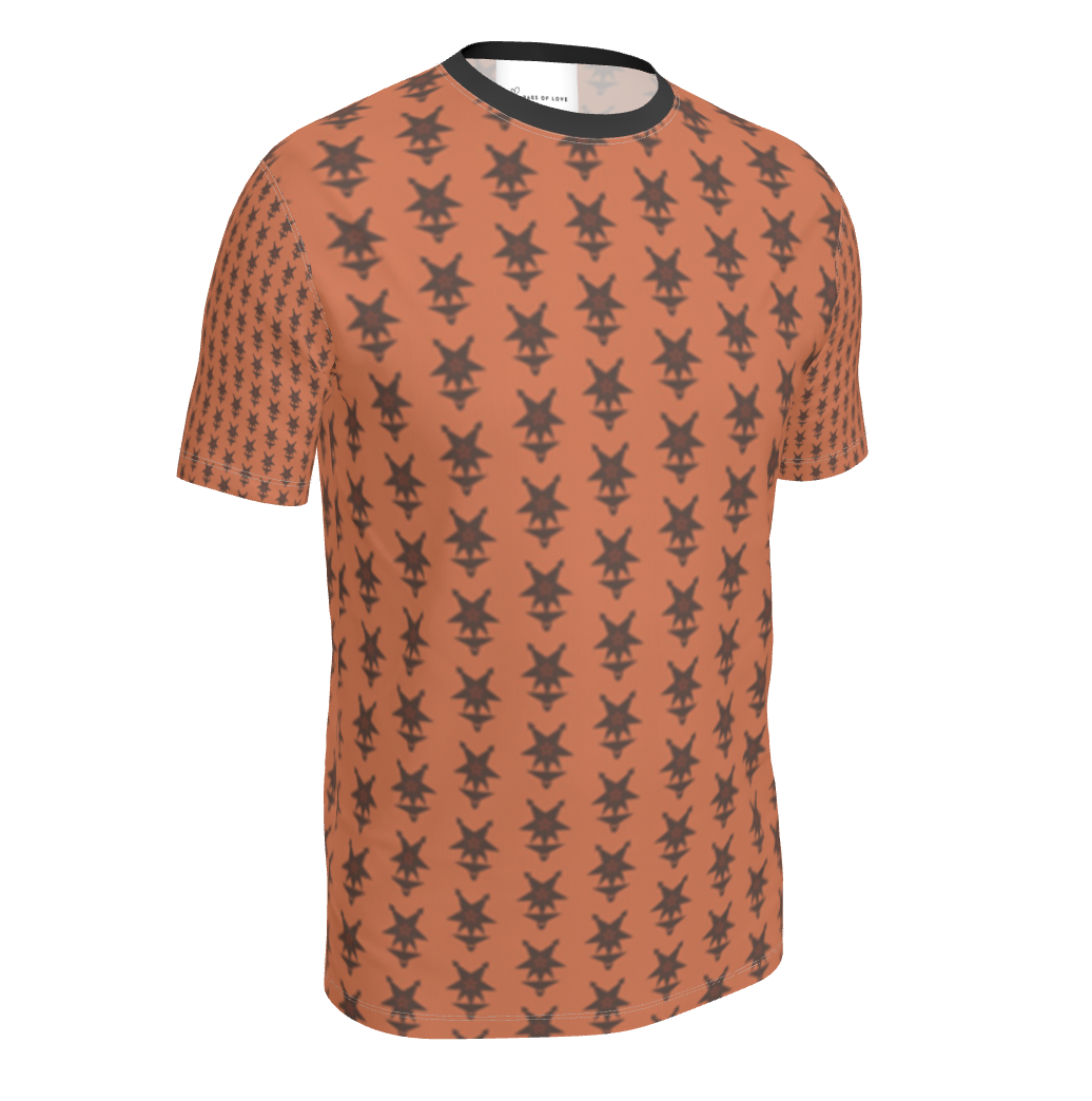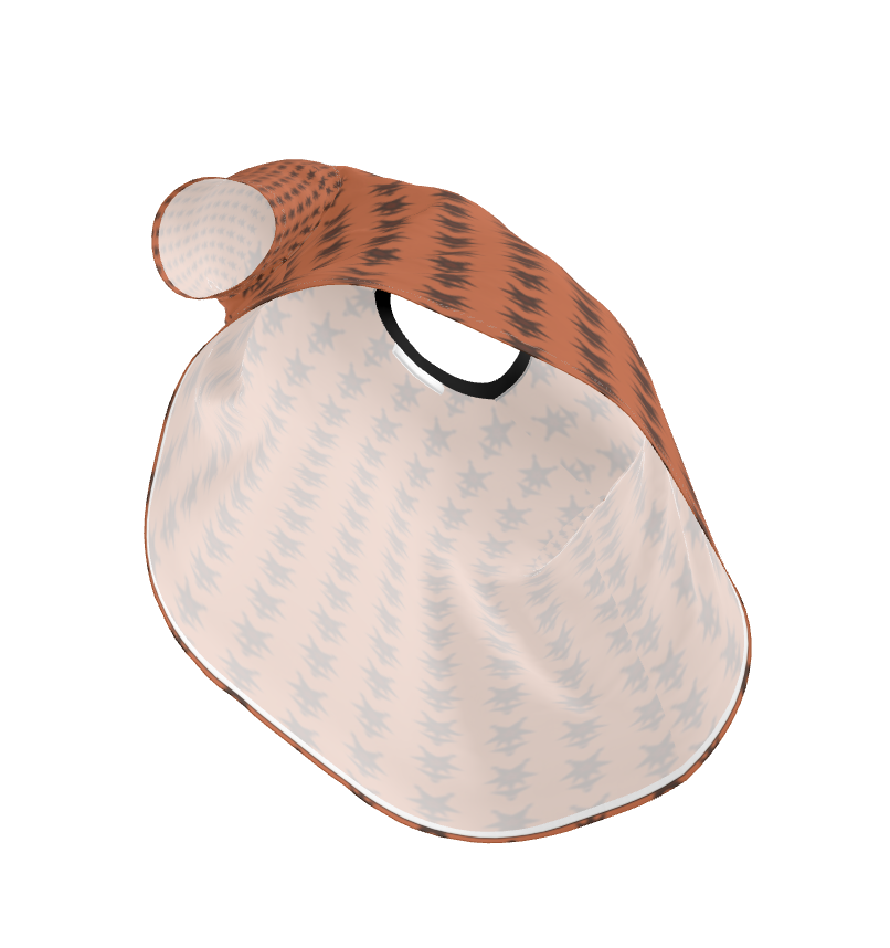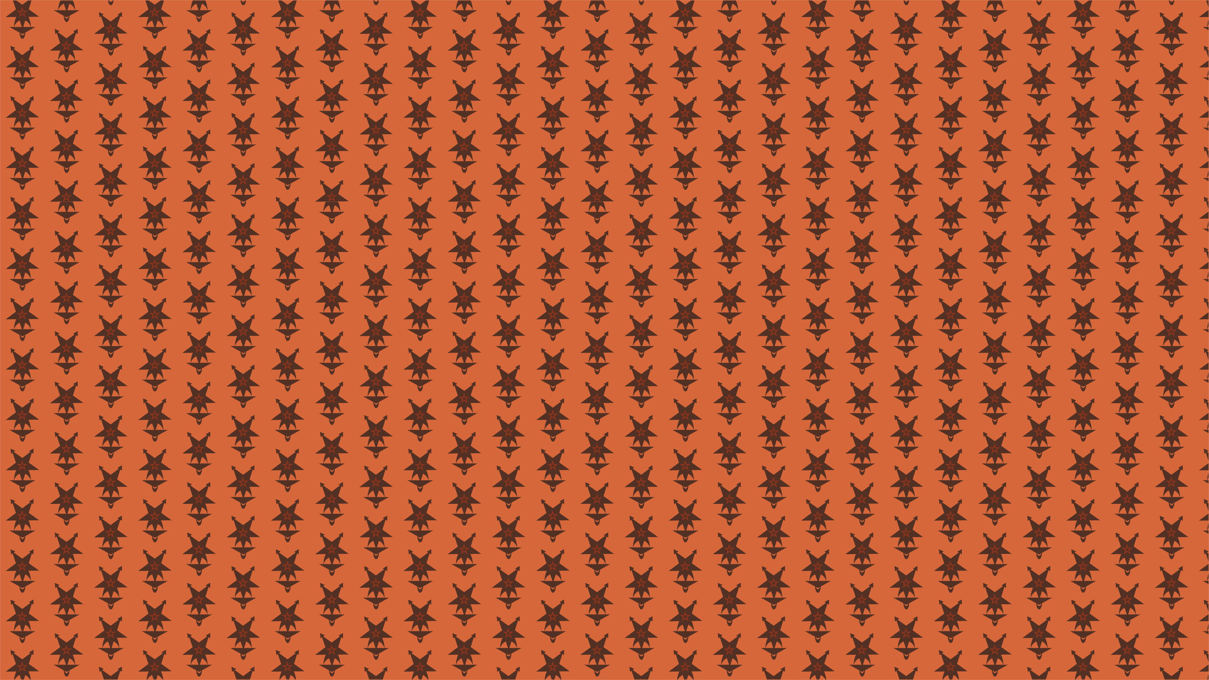
The first pattern I created was a product of playing around in Illustrator, seeing what I could do with the negative space created by stacking shapes. I knew we were going to be putting
these designs on shirts so I had that in mind as I worked. After I had built up the design in plain colors first, I generated a few different monochromatic color schemes in Adobe color.
With all of the layers and intricacies of the pattern, I thought a more simple color scheme would work better. Once I tried it in orange, I thought it had a galactic, space cowboy kind of look.
It would work best as a repeated pattern on gift wrapping or stationary/scrapbooking paper, but could be a cool patterned border for text as well.
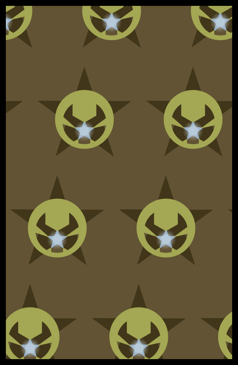
The second pattern I created was inspired primarily by the colors. I created a color mood from an image I found online and wanted
to build on the calming brightness of the image while maintaining thematic cohesion with my first design. It's a little more Star Wars-y but I liked how it looked like a badge. I think this one
repeats better than my first pattern and would be best used as a webiste wallpaper, some kind of set dressing for a sci-fi western film, or as a central emblem on a poster (not necessarily as a
pattern).